Book: The Grammar of Graphics
Grammar: “the fundamental principles or rules of an art or science”
"…rules for constructing graphs mathematically and then representing them as graphics aesthetically."
03 July 2014
Book: The Grammar of Graphics
Grammar: “the fundamental principles or rules of an art or science”
"…rules for constructing graphs mathematically and then representing them as graphics aesthetically."
areas <- c("N", "E", "W", "S", "C")
sales <- c(5, 25, 15, 20, 10)
profit <- c(2, 8, 6, 5, 3)
humble <- data.frame(areas, sales, profit)
humble$areas <-ordered(humble$areas, levels=c("N", "E", "W", "S", "C"))
humble
## areas sales profit ## 1 N 5 2 ## 2 E 25 8 ## 3 W 15 6 ## 4 S 20 5 ## 5 C 10 3


install.packages('ggplot2')
library(ggplot2)
Main arguments
General ggplot syntax
ggplot(data, aes(…)) + geom_x() + … + stat_x + …
Layer specifications
Additional components: scales, coordinates, facet
library(ggplot2) data(diamonds) names(diamonds)
## [1] "carat" "cut" "color" "clarity" "depth" "table" "price" ## [8] "x" "y" "z"
head(diamonds)
## carat cut color clarity depth table price x y z ## 1 0.23 Ideal E SI2 61.5 55 326 3.95 3.98 2.43 ## 2 0.21 Premium E SI1 59.8 61 326 3.89 3.84 2.31 ## 3 0.23 Good E VS1 56.9 65 327 4.05 4.07 2.31 ## 4 0.29 Premium I VS2 62.4 58 334 4.20 4.23 2.63 ## 5 0.31 Good J SI2 63.3 58 335 4.34 4.35 2.75 ## 6 0.24 Very Good J VVS2 62.8 57 336 3.94 3.96 2.48
?diamonds
A data frame with 53940 rows and 10 variables

str(diamonds)
## 'data.frame': 53940 obs. of 10 variables: ## $ carat : num 0.23 0.21 0.23 0.29 0.31 0.24 0.24 0.26 0.22 0.23 ... ## $ cut : Ord.factor w/ 5 levels "Fair"<"Good"<..: 5 4 2 4 2 3 3 3 1 3 ... ## $ color : Ord.factor w/ 7 levels "D"<"E"<"F"<"G"<..: 2 2 2 6 7 7 6 5 2 5 ... ## $ clarity: Ord.factor w/ 8 levels "I1"<"SI2"<"SI1"<..: 2 3 5 4 2 6 7 3 4 5 ... ## $ depth : num 61.5 59.8 56.9 62.4 63.3 62.8 62.3 61.9 65.1 59.4 ... ## $ table : num 55 61 65 58 58 57 57 55 61 61 ... ## $ price : int 326 326 327 334 335 336 336 337 337 338 ... ## $ x : num 3.95 3.89 4.05 4.2 4.34 3.94 3.95 4.07 3.87 4 ... ## $ y : num 3.98 3.84 4.07 4.23 4.35 3.96 3.98 4.11 3.78 4.05 ... ## $ z : num 2.43 2.31 2.31 2.63 2.75 2.48 2.47 2.53 2.49 2.39 ...
Categorical
Bar, Column, Stacked, CoxComb, Pie, Bullseye
summary(diamonds$clarity)
## I1 SI2 SI1 VS2 VS1 VVS2 VVS1 IF ## 741 9194 13065 12258 8171 5066 3655 1790
# ggplot(data = diamonds, aes(x = clarity)) + geom_bar() ggplot(diamonds, aes(clarity)) + geom_bar()

ggplot(diamonds, aes(clarity, fill=clarity)) + geom_bar()

ggplot(diamonds, aes(clarity, fill=clarity)) + geom_bar(width = 1)

ggplot(diamonds, aes(clarity, fill=clarity)) + geom_bar(width = 1) + coord_polar()

ggplot(diamonds, aes(x="", fill=clarity)) +
geom_bar() + xlab('clarity')

ggplot(diamonds, aes(x= "", fill=clarity)) +
geom_bar() + xlab('clarity') + coord_polar(theta = "y")

ggplot(diamonds, aes(x= "", fill=clarity)) +
geom_bar(width = 1) + xlab('clarity') + coord_polar(theta = "x")

Continuous Variables
Histogram
summary(diamonds$price)
## Min. 1st Qu. Median Mean 3rd Qu. Max. ## 326 950 2400 3930 5320 18800
ggplot(diamonds, aes(price)) + geom_histogram()
## stat_bin: binwidth defaulted to range/30. Use 'binwidth = x' to adjust this.

ggplot(diamonds, aes(price)) + geom_histogram(binwidth = 500)

ggplot(diamonds, aes(price)) + geom_histogram(binwidth = 50)

ggplot(diamonds, aes(price)) + geom_histogram(binwidth = 0.02) + scale_x_log10()
## Warning: position_stack requires constant width: output may be incorrect

Categorical vs. Categorical
Stacked Bar, Mosaic
by(diamonds$cut, diamonds$clarity, summary)
## diamonds$clarity: I1 ## Fair Good Very Good Premium Ideal ## 210 96 84 205 146 ## -------------------------------------------------------- ## diamonds$clarity: SI2 ## Fair Good Very Good Premium Ideal ## 466 1081 2100 2949 2598 ## -------------------------------------------------------- ## diamonds$clarity: SI1 ## Fair Good Very Good Premium Ideal ## 408 1560 3240 3575 4282 ## -------------------------------------------------------- ## diamonds$clarity: VS2 ## Fair Good Very Good Premium Ideal ## 261 978 2591 3357 5071 ## -------------------------------------------------------- ## diamonds$clarity: VS1 ## Fair Good Very Good Premium Ideal ## 170 648 1775 1989 3589 ## -------------------------------------------------------- ## diamonds$clarity: VVS2 ## Fair Good Very Good Premium Ideal ## 69 286 1235 870 2606 ## -------------------------------------------------------- ## diamonds$clarity: VVS1 ## Fair Good Very Good Premium Ideal ## 17 186 789 616 2047 ## -------------------------------------------------------- ## diamonds$clarity: IF ## Fair Good Very Good Premium Ideal ## 9 71 268 230 1212
ggplot(diamonds, aes(x=cut, fill=clarity)) + geom_bar()

ggplot(diamonds, aes(x=cut, fill=clarity)) + geom_bar(position = "dodge")

ggplot(diamonds, aes(x=cut, fill=clarity)) + geom_bar(position = "fill")

No direct function - But you can easily write it
ggMMplot <- function(var1, var2){
require(ggplot2)
levVar1 <- length(levels(var1))
levVar2 <- length(levels(var2))
jointTable <- prop.table(table(var1, var2))
plotData <- as.data.frame(jointTable)
plotData$marginVar1 <- prop.table(table(var1))
plotData$var2Height <- plotData$Freq / plotData$marginVar1
plotData$var1Center <- c(0, cumsum(plotData$marginVar1)[1:levVar1 -1]) +
plotData$marginVar1 / 2
ggplot(plotData, aes(var1Center, var2Height)) +
geom_bar(stat = "identity", aes(width = marginVar1, fill = var2), col = "white") +
geom_text(aes(label = as.character(var1), x = var1Center,
y = 1.05), size = 4, color = "grey")}
ggMMplot(diamonds$cut, diamonds$clarity)
## Warning: position_stack requires constant width: output may be incorrect

Continuous vs. Categorical
Histogram - Aesthetics, Facets, Frequency Polygon, Density Box_plot
by(diamonds$price, diamonds$cut, summary)
## diamonds$cut: Fair ## Min. 1st Qu. Median Mean 3rd Qu. Max. ## 337 2050 3280 4360 5210 18600 ## -------------------------------------------------------- ## diamonds$cut: Good ## Min. 1st Qu. Median Mean 3rd Qu. Max. ## 327 1140 3050 3930 5030 18800 ## -------------------------------------------------------- ## diamonds$cut: Very Good ## Min. 1st Qu. Median Mean 3rd Qu. Max. ## 336 912 2650 3980 5370 18800 ## -------------------------------------------------------- ## diamonds$cut: Premium ## Min. 1st Qu. Median Mean 3rd Qu. Max. ## 326 1050 3180 4580 6300 18800 ## -------------------------------------------------------- ## diamonds$cut: Ideal ## Min. 1st Qu. Median Mean 3rd Qu. Max. ## 326 878 1810 3460 4680 18800
ggplot(diamonds, aes(price, fill=cut)) + geom_bar(binwidth = 500)

ggplot(diamonds, aes(price, fill=cut)) + geom_bar(binwidth = 500) + facet_wrap(~ cut)

ggplot(diamonds, aes(price, fill=cut)) + geom_bar(binwidth = 500) + facet_wrap(~ cut, scales="free")

ggplot(diamonds, aes(price, color = cut)) + geom_freqpoly(binwidth = 500)

ggplot(diamonds, aes(price, ..density.., color=cut)) + geom_freqpoly(binwidth = 500)

ggplot(diamonds, aes(cut, price, color = cut)) + geom_point()

ggplot(diamonds, aes(cut, price, color = cut)) + geom_point(alpha = 0.1)

ggplot(diamonds, aes(cut, price, color = cut)) + geom_jitter()

ggplot(diamonds, aes(cut, price, fill = cut)) + geom_boxplot()

ggplot(diamonds, aes(cut, price, fill = cut)) + geom_jitter(size = 1) + geom_boxplot()

Continuous vs. Continuous
Scatterplot - Aesthetics, Facets
ggplot(diamonds, aes(carat, price)) + geom_point()

ggplot(diamonds, aes(carat, price)) + geom_point(size = 1)

ggplot(diamonds, aes(carat, price)) + geom_point(alpha = 0.2)

ggplot(diamonds, aes(carat, price)) + geom_bin2d()

ggplot(diamonds, aes(carat, price)) + geom_hex()

ggplot(diamonds, aes(carat, price)) + geom_smooth()
## geom_smooth: method="auto" and size of largest group is >=1000, so using gam with formula: y ~ s(x, bs = "cs"). Use 'method = x' to change the smoothing method.

ggplot(diamonds, aes(carat, price)) + geom_point() + xlim(c(0, 3.1))
## Warning: Removed 14 rows containing missing values (geom_point).

ggplot(diamonds, aes(carat, price)) + geom_point() + scale_y_log10()

ggplot(diamonds, aes(carat, price)) + geom_point(alpha = 0.3) + scale_y_log10() + scale_x_log10()

ggplot(diamonds, aes(carat, price)) + geom_point(alpha = 0.3) + scale_y_log10() + scale_x_log10() + geom_smooth(method = lm)

ggplot(diamonds, aes(carat, price, color = cut)) + geom_point(alpha = 0.3)

ggplot(diamonds, aes(carat, price, color = cut)) + geom_point(size=1) + facet_wrap(~ cut)

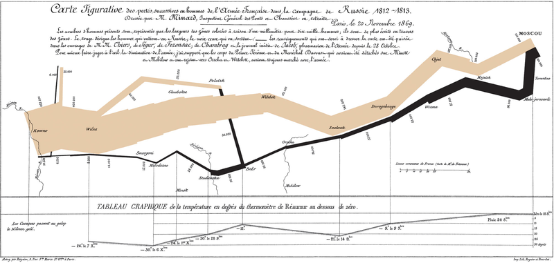
## troops <- read.table(url("http://amitkaps.com/data/minard-troops.txt"), header = TRUE)
troops <- read.table("data/minard-troops.txt", header = TRUE)
troops
## long lat survivors direction group ## 1 24.0 54.9 340000 A 1 ## 2 24.5 55.0 340000 A 1 ## 3 25.5 54.5 340000 A 1 ## 4 26.0 54.7 320000 A 1 ## 5 27.0 54.8 300000 A 1 ## 6 28.0 54.9 280000 A 1 ## 7 28.5 55.0 240000 A 1 ## 8 29.0 55.1 210000 A 1 ## 9 30.0 55.2 180000 A 1 ## 10 30.3 55.3 175000 A 1 ## 11 32.0 54.8 145000 A 1 ## 12 33.2 54.9 140000 A 1 ## 13 34.4 55.5 127100 A 1 ## 14 35.5 55.4 100000 A 1 ## 15 36.0 55.5 100000 A 1 ## 16 37.6 55.8 100000 A 1 ## 17 37.7 55.7 100000 R 1 ## 18 37.5 55.7 98000 R 1 ## 19 37.0 55.0 97000 R 1 ## 20 36.8 55.0 96000 R 1 ## 21 35.4 55.3 87000 R 1 ## 22 34.3 55.2 55000 R 1 ## 23 33.3 54.8 37000 R 1 ## 24 32.0 54.6 24000 R 1 ## 25 30.4 54.4 20000 R 1 ## 26 29.2 54.3 20000 R 1 ## 27 28.5 54.2 20000 R 1 ## 28 28.3 54.3 20000 R 1 ## 29 27.5 54.5 20000 R 1 ## 30 26.8 54.3 12000 R 1 ## 31 26.4 54.4 14000 R 1 ## 32 25.0 54.4 8000 R 1 ## 33 24.4 54.4 4000 R 1 ## 34 24.2 54.4 4000 R 1 ## 35 24.1 54.4 4000 R 1 ## 36 24.0 55.1 60000 A 2 ## 37 24.5 55.2 60000 A 2 ## 38 25.5 54.7 60000 A 2 ## 39 26.6 55.7 40000 A 2 ## 40 27.4 55.6 33000 A 2 ## 41 28.7 55.5 33000 A 2 ## 42 28.7 55.5 33000 R 2 ## 43 29.2 54.2 30000 R 2 ## 44 28.5 54.1 30000 R 2 ## 45 28.3 54.2 28000 R 2 ## 46 24.0 55.2 22000 A 3 ## 47 24.5 55.3 22000 A 3 ## 48 24.6 55.8 6000 A 3 ## 49 24.6 55.8 6000 R 3 ## 50 24.2 54.4 6000 R 3 ## 51 24.1 54.4 6000 R 3
plot_troops <- ggplot(troops, aes(long, lat)) + geom_path(aes(size = survivors, color = direction, group = group)) plot_troops

## cities <- read.table(url("http://amitkaps.com/data/minard-cities.txt"), header = TRUE)
cities <- read.table("data/minard-cities.txt", header = TRUE)
cities
## long lat city ## 1 24.0 55.0 Kowno ## 2 25.3 54.7 Wilna ## 3 26.4 54.4 Smorgoni ## 4 26.8 54.3 Moiodexno ## 5 27.7 55.2 Gloubokoe ## 6 27.6 53.9 Minsk ## 7 28.5 54.3 Studienska ## 8 28.7 55.5 Polotzk ## 9 29.2 54.4 Bobr ## 10 30.2 55.3 Witebsk ## 11 30.4 54.5 Orscha ## 12 30.4 53.9 Mohilow ## 13 32.0 54.8 Smolensk ## 14 33.2 54.9 Dorogobouge ## 15 34.3 55.2 Wixma ## 16 34.4 55.5 Chjat ## 17 36.0 55.5 Mojaisk ## 18 37.6 55.8 Moscou ## 19 36.6 55.3 Tarantino ## 20 36.5 55.0 Malo-Jarosewii
plot_troops_cities <- plot_troops + geom_text(aes(label = city), size = 4, data = cities) plot_troops_cities

library(maps)
library(mapproj)
plot_polished <- plot_troops_cities +
scale_size(range = c(1, 10),
breaks = c(1, 2, 3) * 10^5,
labels = c(1, 2, 3) * 10^5 )+
scale_color_manual(values = c("grey50","red")) +
xlab(NULL) +
ylab(NULL) +
coord_map()
plot_polished

Resources & Books
Courses
Amit Kapoor
Partner, narrativeVIZ Consulting
You can find this presentation and more at: