
02 June 2014
How many 5's can you find?
Proximity

Alignment

Repetition

Contrast

Subtraction

Making Sense of Data
"The ability to take data—to be able to understand it, to process it, to extract value from it, to visualize it, to communicate it—that’s going to be a hugely important skill in the next decades, … because now we really do have essentially free and ubiquitous data. So the complimentary scarce factor is the ability to understand that data and extract value from it."
Hal Varian, Google’s Chief Economist
Focus their Attention
“What information consumes is rather obvious: it consumes the attention of its recipients. Hence a wealth of information creates a poverty of attention, and a need to allocate that attention efficiently among the overabundance of information sources that might consume it.”
Herb Simon
Modes of Thinking
- Writing (Verbal)
- Symbolic (Math-logic)
- Geometric (Visual)
- Interactive (Kinesthetic)
Writing (Verbal)
Pythagoras' Theorem
The Pythagoras' theorem is a relation in Euclidean geometry among the three sides of a right triangle. It states that the square of the hypotenuse (the side opposite the right angle) is equal to the sum of the squares of the other two sides.
Symbolic (Math-logic)
Pythagoras' Theorem
For all \(\triangle XYZ\), where \(\angle XYZ = 90^\circ\) and length of side \(XY = a\), \(YZ = b\) and \(XZ = c\), there exist a relationship such that:
\(a^2 + b^2 = c^2\)
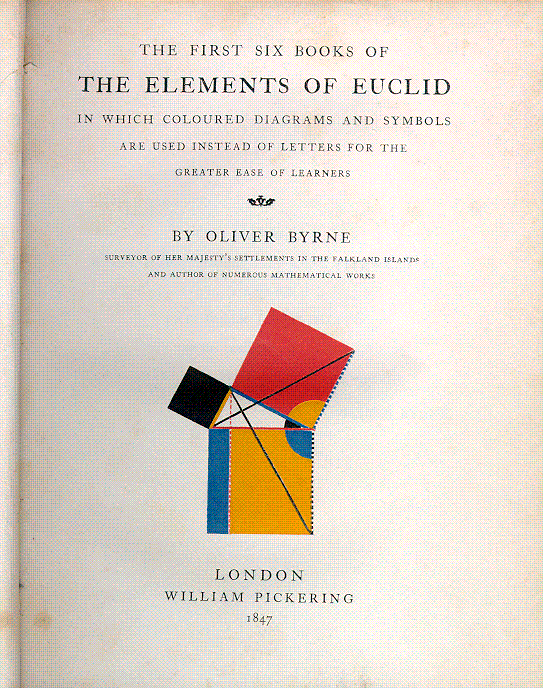
Geometric (Visual)
Pythagoras' Theorem

The First Six Books of The Element of Euclid by Oliver Byrne
Interactive (Kinesthetic)
Pythagoras' Theorem

Visual Power of the Human Brain

Pattern Recognition Machine
Simple
- Driving on the Road
- Facial Expression
- Face Recognition
Complex
- CAPTCHA (Completely Automated Public Turing test to tell Computers and Humans Apart)
- Chess and Go
- Metrological Forecasts
Visualization
/ˌvɪʒʊəlaɪˈzeɪʃən / (noun)
Derived from the Latin verb videre, "to look, to see"
"The act or instance to form a mental image or picture (without an object) or… the act or instance to make visible or visual (with an object)"
“Transformation of the symbolic into the geometric” - McCormick et al. 1987
“The use of computer-generated, interactive, visual representations of abstract data to amplify cognition.” - Card, Mackinlay, & Shneiderman 1999
The Value of Visualization
Expression | Decorative - Data Art for visual expression, delight (and impact)
Flight Patterns, Internet Census
Exploration | Interactive - Data Tool for engagement, exploration and discovery
Cricket Batting, Working Capital Profiler
Explanation | Narrative - Data Stories for telling a specific and (mostly linear) visual narrative
The Joy of Stats, Wealth Inequality, Out of Sight, Out of Mind
Graphical Inference

William Playfair (1786)

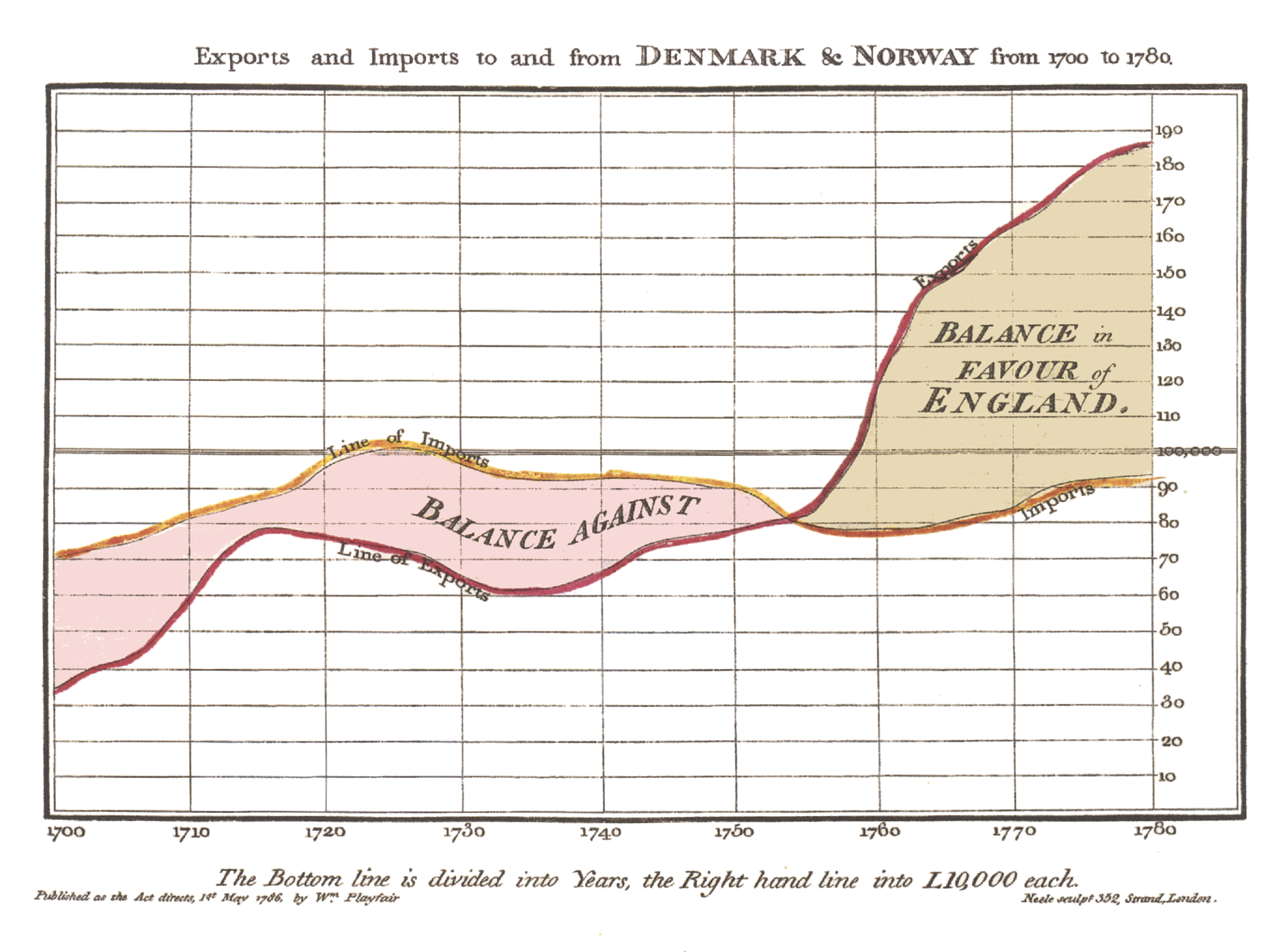
Johann Lambert (1786)

Graph of rate of evaporation of water vs. temperature
John Snow (1854)
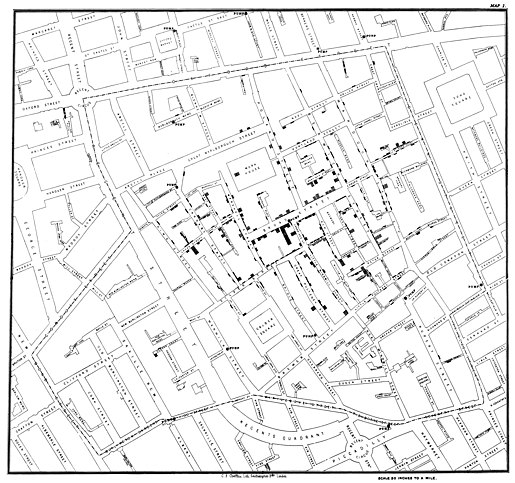
Florence Nightingale (1857)

Charles Minard (1869)
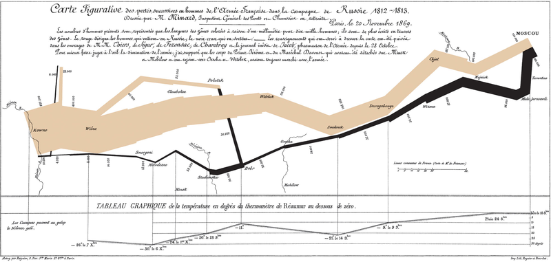
Jacques Bertin (1967)
Book: Sémiologie graphique / Semiology of Graphics
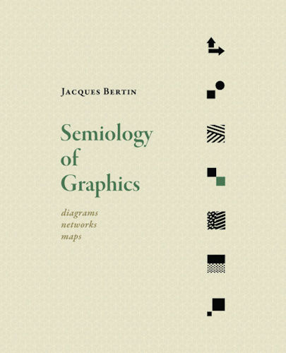
Visual language is a sign language
- Images perceived as a set of signs
- Sender encodes information in signs
- Receiver decodes information from signs
“… finding the artificial memory that best supports our natural means of perception.”
Jacques Bertin (1967)

- A, B, C are distinguishable
- B is between A and C.
- BC is twice as long as AB.
∴ Encode quantitative variables
"Resemblance, order and proportion are the three signifieds in graphics.” - Bertin
Francis Anscombe (1973)
Anscombe's Quartet
anscombe
##    x1 x2 x3 x4    y1   y2    y3    y4
## 1  10 10 10  8  8.04 9.14  7.46  6.58
## 2   8  8  8  8  6.95 8.14  6.77  5.76
## 3  13 13 13  8  7.58 8.74 12.74  7.71
## 4   9  9  9  8  8.81 8.77  7.11  8.84
## 5  11 11 11  8  8.33 9.26  7.81  8.47
## 6  14 14 14  8  9.96 8.10  8.84  7.04
## 7   6  6  6  8  7.24 6.13  6.08  5.25
## 8   4  4  4 19  4.26 3.10  5.39 12.50
## 9  12 12 12  8 10.84 9.13  8.15  5.56
## 10  7  7  7  8  4.82 7.26  6.42  7.91
## 11  5  5  5  8  5.68 4.74  5.73  6.89
Anscombe's Quartet
Computing the Stats
Mean
\(\mu_x = 9\); \(\mu_y = 7.5\)
Variance and Correlation
\(\sigma^2_x = 11\); \(\sigma^2_x = 4.1\); \(cor(x,y) = 0.816\)
Linear Regression
\(y = 3.00 + 0.500x\)
\(R^2 = 0.667\)
Anscombe's Quartet
Plot the Relationship
 ## John Tukey (1977) Exploratory Data Analysis: An approach to analyze data sets to summarize their main characteristics, often with visual methods

Edward Tufte (1983)
Book: The Visual Display of Quantiative Information
“Above all else, show the data.”
Data-Ink ratio = data-ink / total-ink used in graphics
Edward Tufte (1983)
Don't lie with statistics

William Cleveland (1985)
Book: Element of Graphing Data
"The important criterion for a graph is not simply how fast we can see a result; rather it is whether through the use of the graph we can see something that would have been harder to see otherwise or that could not have been seen at all."
- A graphic should display as much information as it can, with the lowest possible cognitive strain to the viewer.
- Visualization is an iterative process. Graph the data, learn what you can, and then regraph the data to answer the questions that arise from your previous graphic.
William Cleveland (1985)
Dot Plots

A Thirty Year Comparison
| Aspects | Macintosh | MacBook | Change |
|---|---|---|---|
| Year | 1984 | 2014 | +30 |
| Cost | $2,500 | $999 | 2/5x |
| Speed | 8MHz | 1.4GHz | 175x |
| Memory | 128KB | 4GB | 30,000x |
| Pixels | 512 x 342 | 1440 x 900 | 7.4x |
| Screen | 72PPI (9in) | 128PPI (13.3in) | 1.8x |
Leland Wilkinson (1999)
Book: The Grammar of Graphics
Grammar: “the fundamental principles or rules of an art or science”
"…rules for constructing graphs mathematically and then representing them as graphics aesthetically."
Three metaphors for thinking about visualization
- Canvas (Sketch it out)
- Graphics (Objects to constructs graphs)
- Charts (Catalog of chart types)
R Graphics Package
Base Graphics: Written by Ross Ihaka based on experience from S graphics. A pen on paper model and there is no (user accessible) representation of the graphics. Base graphics functions are generally fast, but have limited scope.
grid graphics: Developed by Paul Murrell (2000), Grid grobs (graphical objects) can be represented independently of the plot and modified later. Grid provides drawing primitives, but no tools for producing statistical graphics.
lattice: Developed by Deepayan Sarkar (2008), uses grid graphics to implement the trellis graphics system of Cleveland. You can easily produce conditioned plots but it lacks a formal model
ggplot2: Developed by Hadley Wickam (2007), takes the good things of lattice with the underlying layered grammar of graphics approach. Easy to draw wide range of graphics with compact syntax and independent components
The layered graphics of grammar (1/4)

The layered graphics of grammar (2/4)

The layered graphics of grammar (3/4)

The layered graphics of grammar (4/4)

ggplot2: Layered grammar of graphics
- data: The data that you want to visualise.
- aes: A set of aesthetic mappings describing how variables in the data are mapped to aesthetic attributes that you can perceive.
- geom: Geometric objects represent what you actually see on the plot: points, lines, polygons, etc.
- stat: Statistical transformations summarise data in many useful ways. For example, binning and counting observations to create a histogram, or summarising a 2d relationship with a linear model.
ggplot2: Layered grammar of graphics
- scales: The scales map values in the data space to values in an aesthetic space, whether it be colour, or size, or shape. Scales draw a legend or axes, which provide an inverse mapping to make it possible to read the original data values from the graph.
- coord: A coordinate system describes how data coordinates are mapped to the plane of the graphic. It also provides axes and gridlines to make it possible to read the graph. We normally use a Cartesian coordinate system, but a number of others are available, including polar coordinates and map projections.
- facet: A faceting specification describes how to break up the data into subsets and how to display those subsets as small multiples. This is also known as conditioning or latticing/trellising.
Getting started with ggplot2
install.packages('ggplot2')
library(ggplot2)
Basic Syntax
Main arguments
- data set, usually a data.frame
- aesthetic mappings provided by aes function
General ggplot syntax
ggplot(data, aes(…)) + geom_x() + … + stat_x + …
Layer specifications
- geom_*(mapping, data, …, geom, position)
- stat_*(mapping, data, …, stat, position)
Additional components: scales, coordinates, facet
Visualization Assignment
You are working as a team member in a large global project to develop the digital ad strategy for your company. As part of the project, you need to provide an overview of the computing devices the consumers are likely to use to interact with these digital ads.
You have received a spreadsheet from an analyst about these computing devices. These computing devices are been tracked in three main categories - PCs (including desktops and laptops), Tablets and Smartphones. The data sheet includes historical and forecasted data on shipments (devices shipped to the consumer) and installed base (devices being used by the consumers) for these computing devices. In addition, you also have the same data segmented by Operating System (OS) being used on each of these devices.
The data sheet by the analyst is available at http://goo.gl/Zy6lcR
Visualization Assignment (contd.)
You need to develop a short data visualization for this data set and problem statement (using your preferred visualization and presentation tool). Please do use the data shared by the analyst, though you are free to enrich the same with any additional data or insights from external sources.
You will have 5 minutes to share this overview with the global project team as part of the next project discussion. Please prepare the visualizations accordingly.
Contact
Amit Kapoor
Partner, narrativeVIZ Consulting